Evolving the Etex identity from holding to global brand
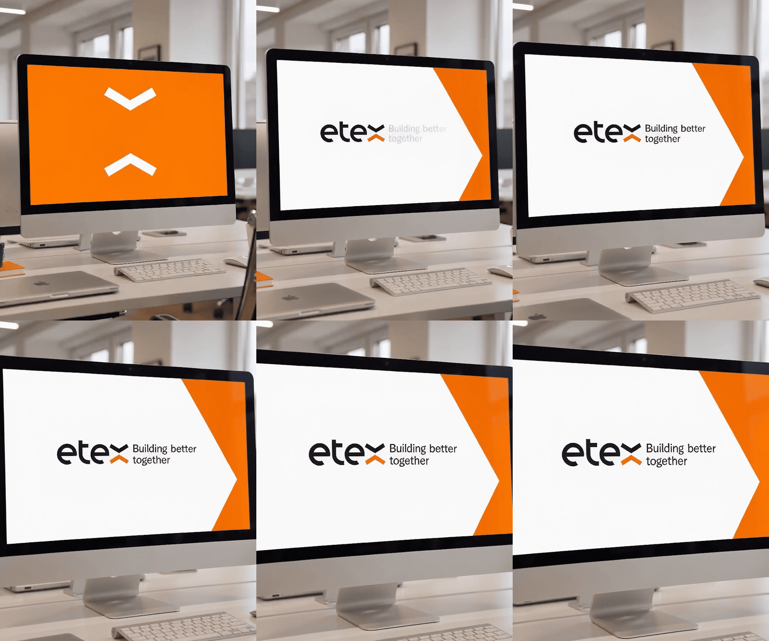
Etex is a global leader in construction, active in 47 countries. In 2019 we created its visual identity. In 2026 we evolved it: the iconic emblem stayed, the system around it became simpler, more flexible and fully accessible, and a refined purpose, Building better together, set the new direction.
From holding to global brand
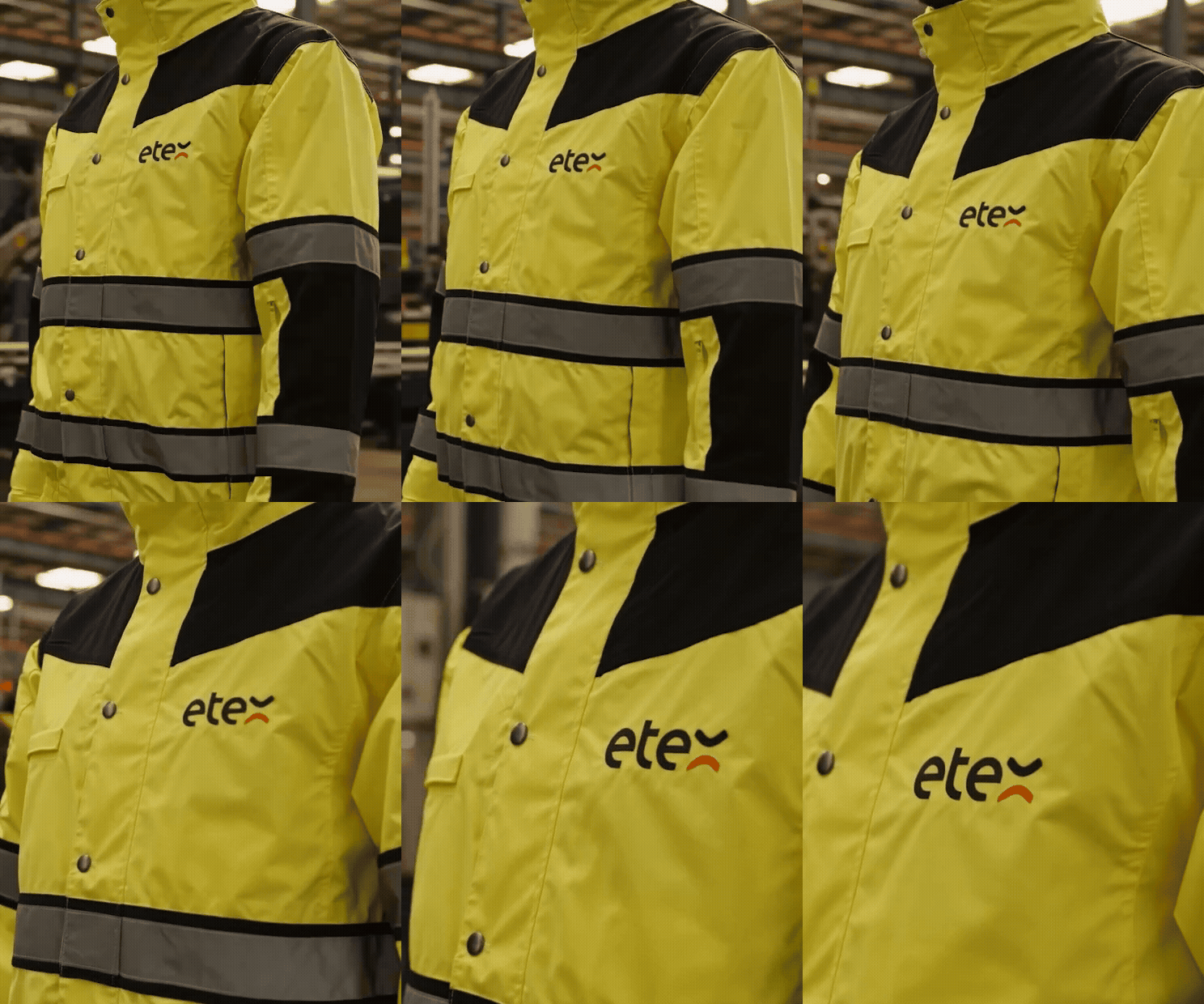
In 2019, June20 built the visual identity of Etex around lightweight construction solutions and openness towards stakeholders. Today, Etex is a group with close to 13,500 teammates, more than 190 sites and brands such as Cedral, EQUITONE, Promat, Siniat and URSA. The identity had to follow that shift, from a holding to a global leading brand, without losing what makes Etex recognisable.
Purpose first, design second
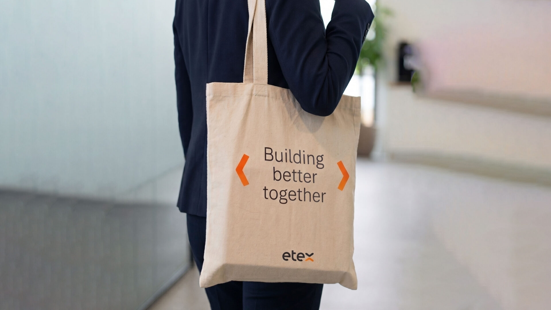
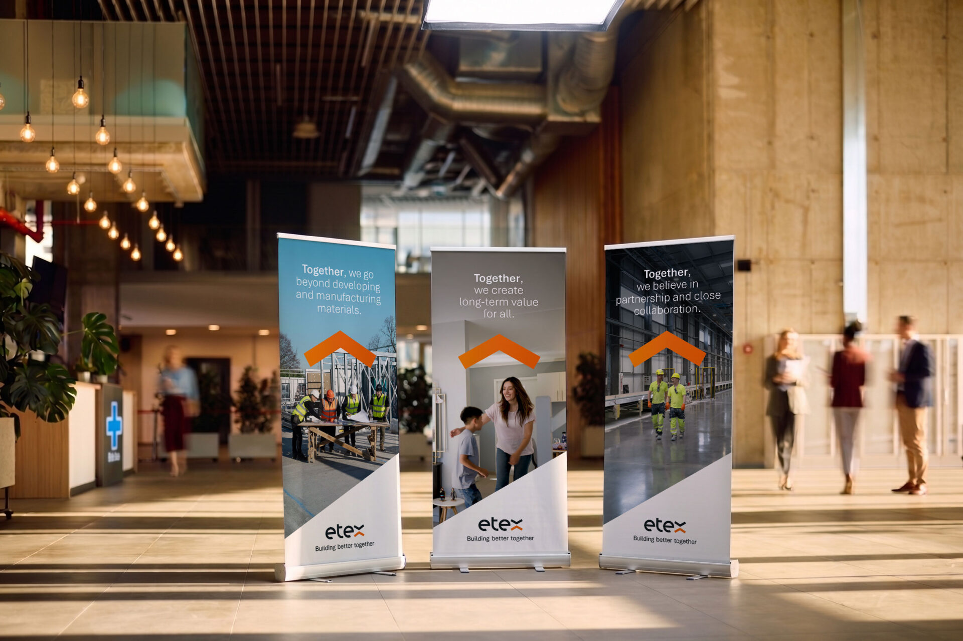
We started from strategy, in close collaboration with the Etex team and sector advisors. The refined purpose, Building better together, rests on three building blocks. Building stands for innovative solutions that make buildings more efficient and housing more affordable and climate resilient. Better stands for growth for all, today and tomorrow. Together stands for partnership and collaboration across divisions, platforms, partners and customers, creating ecosystems. The identity had to make that visible.
Same emblem, simpler system
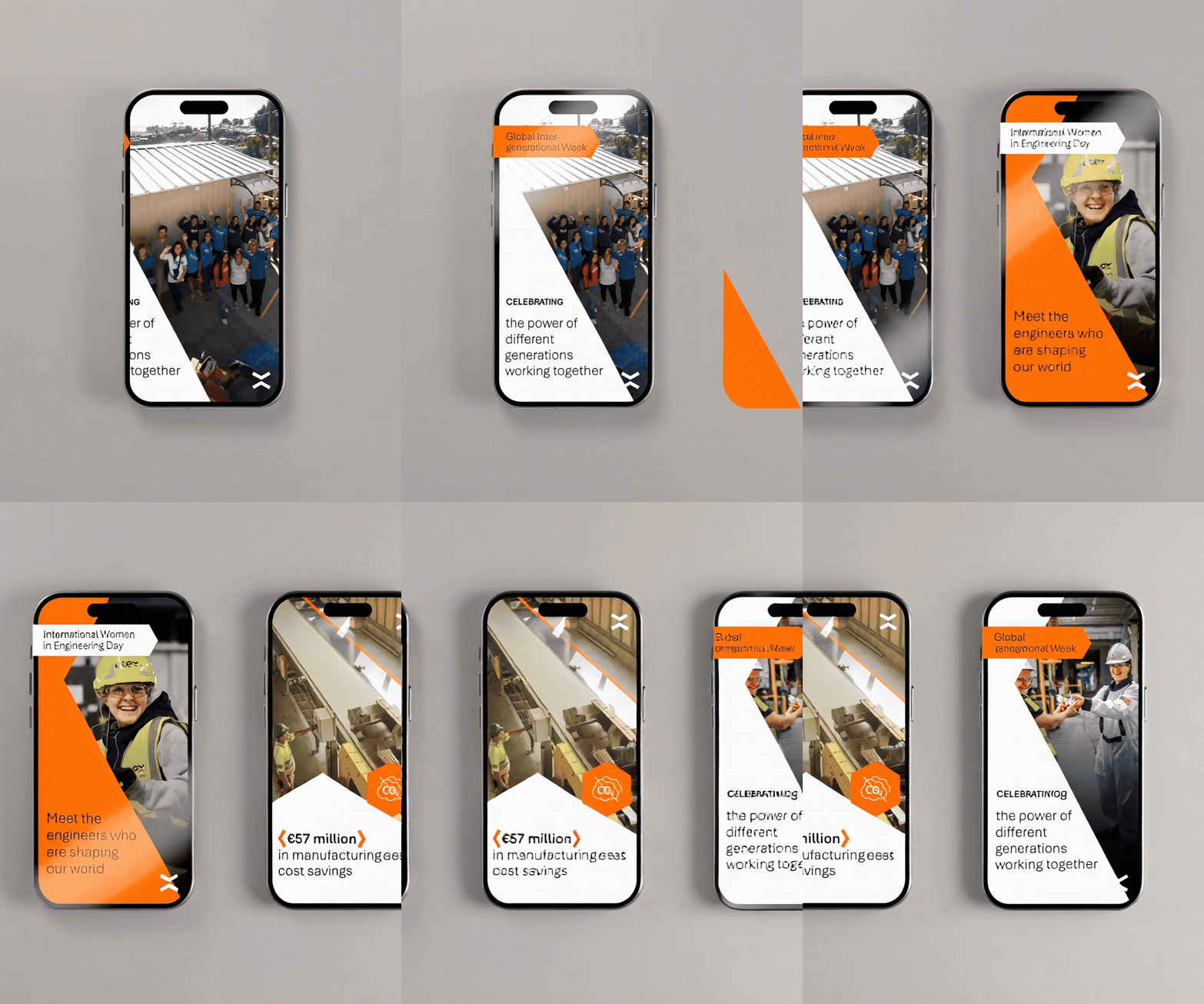
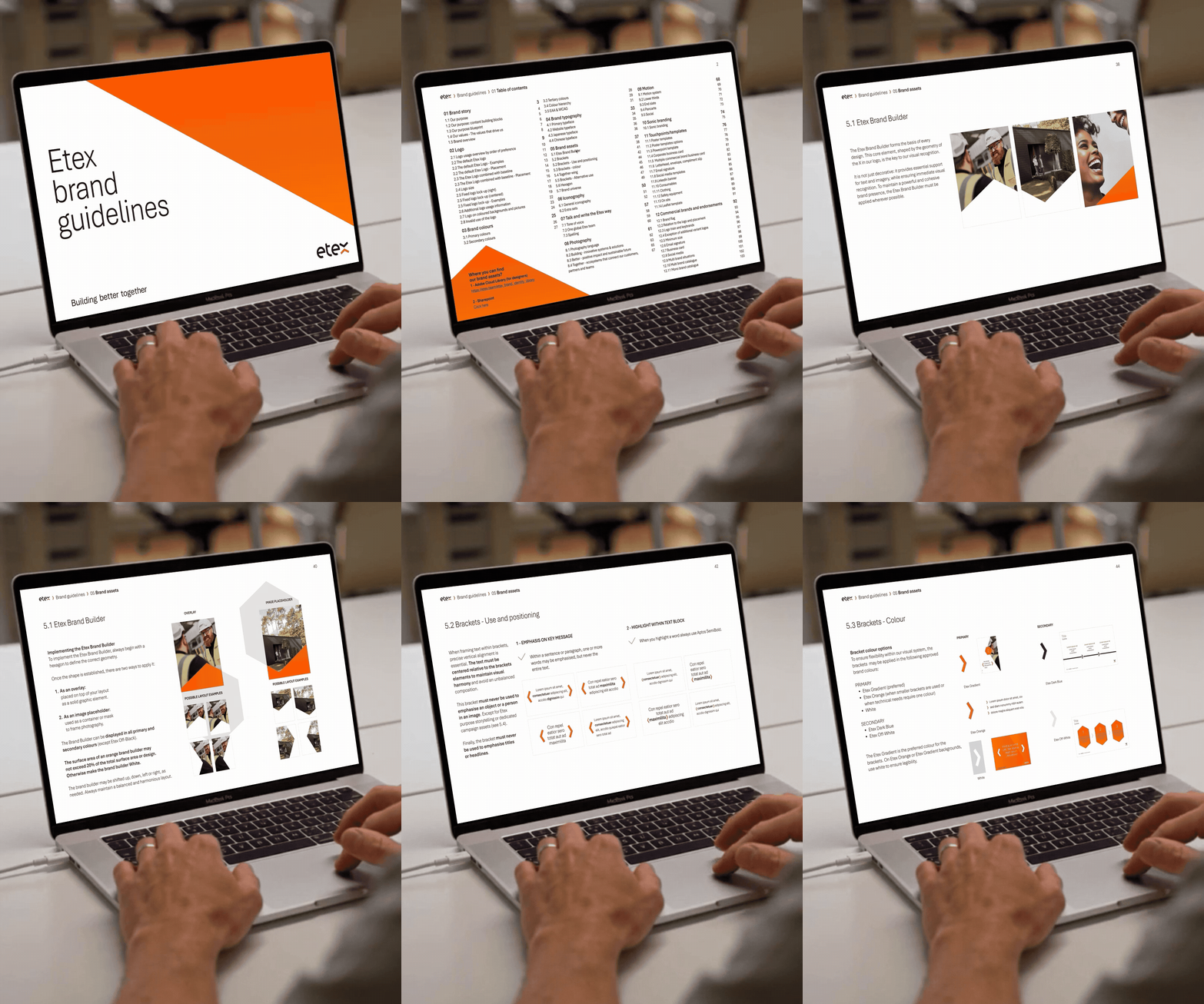
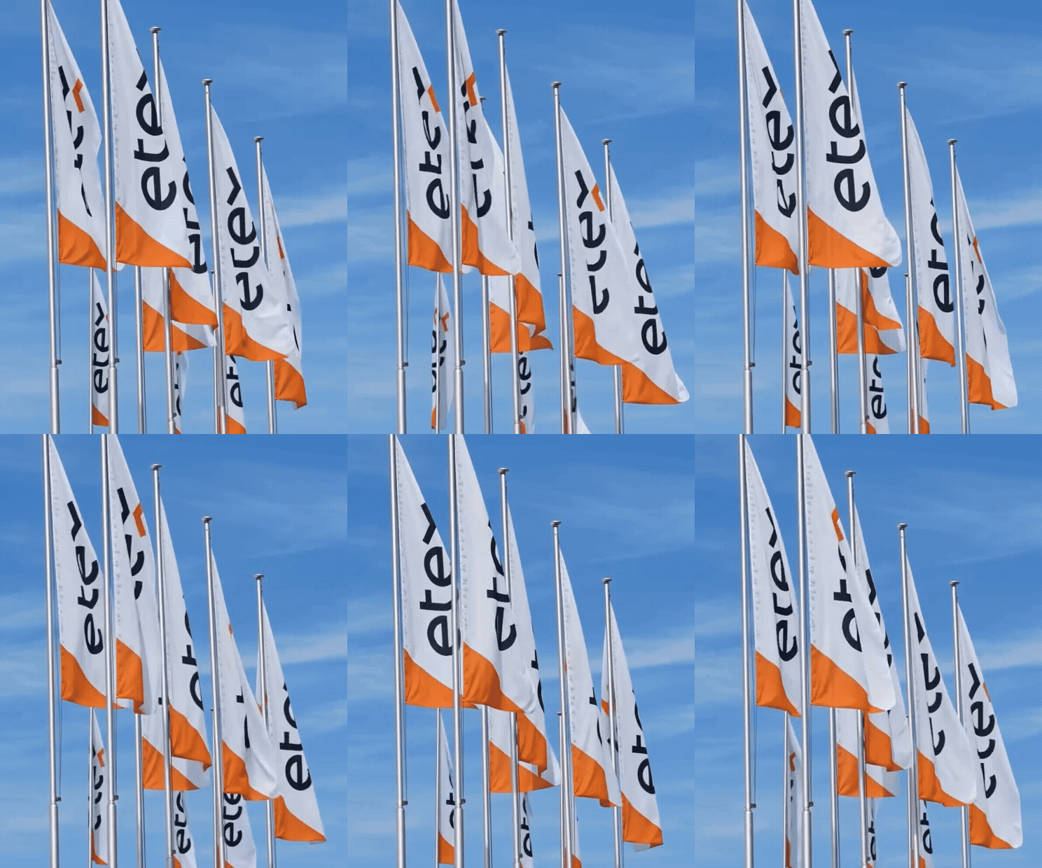
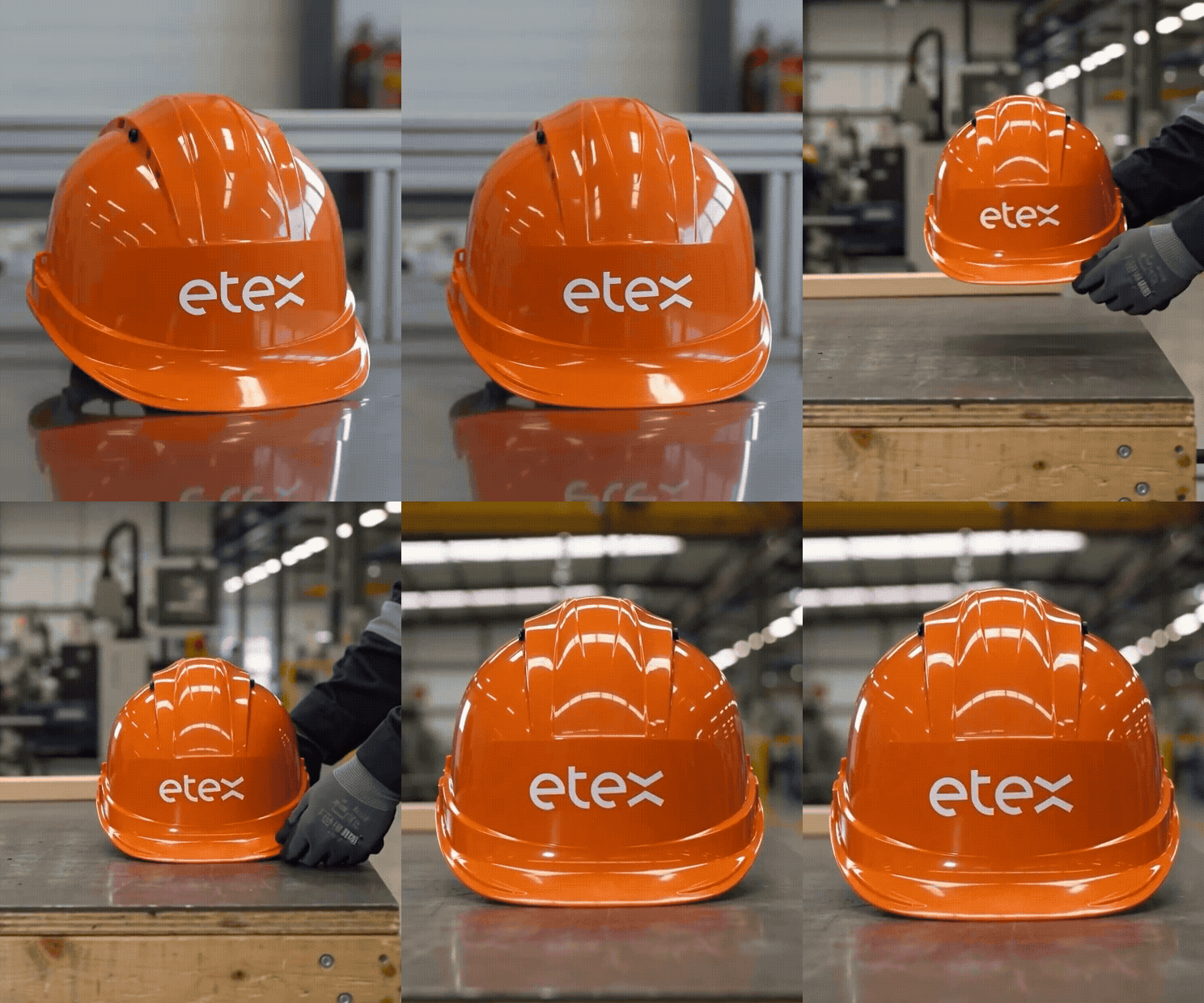
The iconic Etex emblem stayed untouched, and so did the Etex orange. Around them we simplified the design system. The hexagon was reinvented, grounded in the geometry of natural honeycombs, nature’s most efficient way to use space without gaps, and now symbolises connectivity, upward movement and sustained growth. An orange gradient and a lighter dark blue widen the palette. The logo became the base for three tools: the brand builder, a dynamic frame for images and text; dynamic framing, accent shapes that direct focus; and hexagon geometry, modular grids that express continuous momentum.
Accessible for everyone
Etex is committed to inclusion, so the identity had to be accessible too. We developed the evolution in line with the European Accessibility Act and the WCAG guidelines, and calibrated contrast ratios, typographic hierarchy and motion branding elements so the brand works on platforms around the world. The lighter dark blue supports that as well.
Launched inside and out
The new purpose and identity were launched with an internal and external communication campaign, developed together with Etex. The result is a flexible, straightforward framework for a brand that is used worldwide, and ready for what comes next.
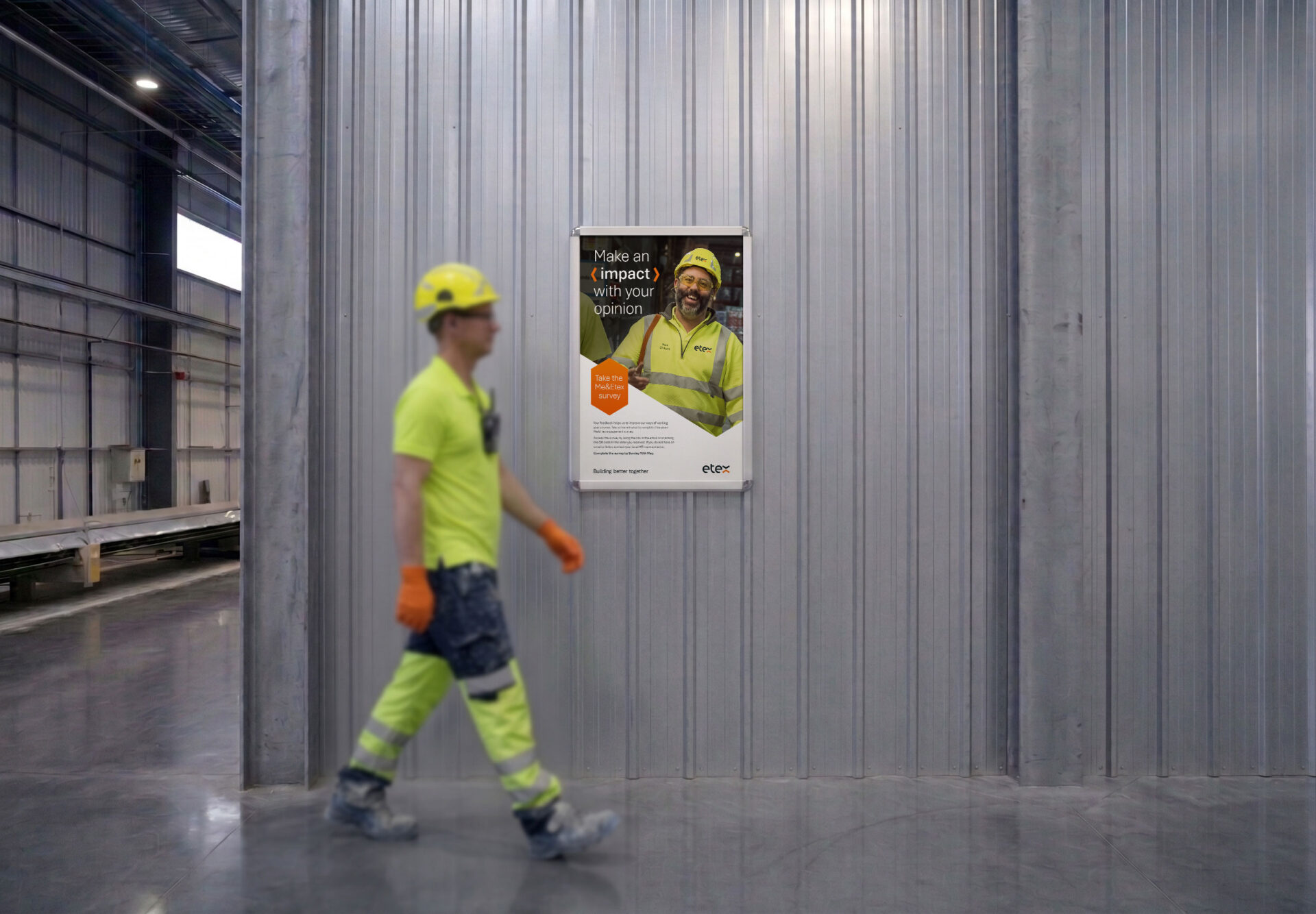
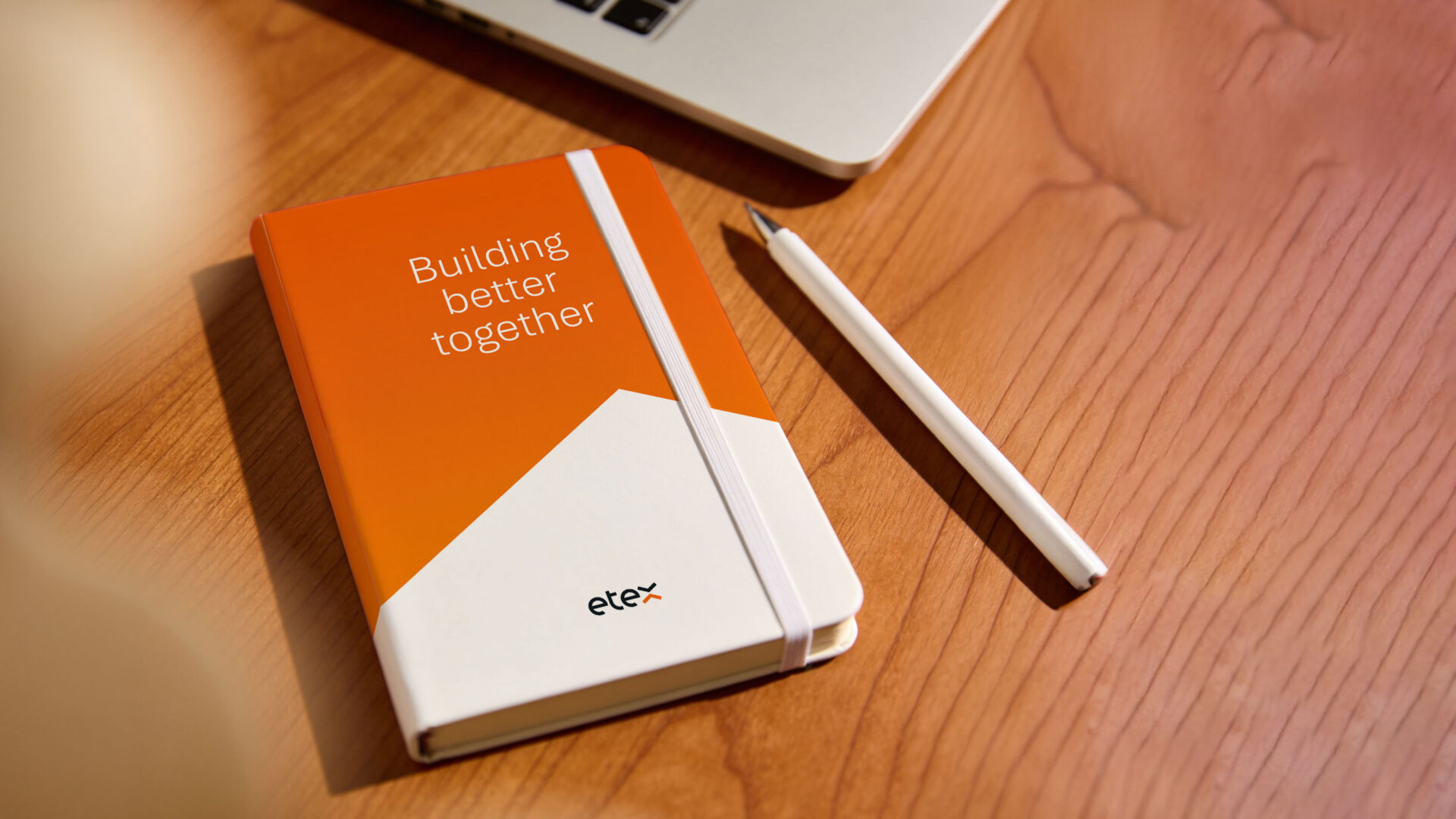
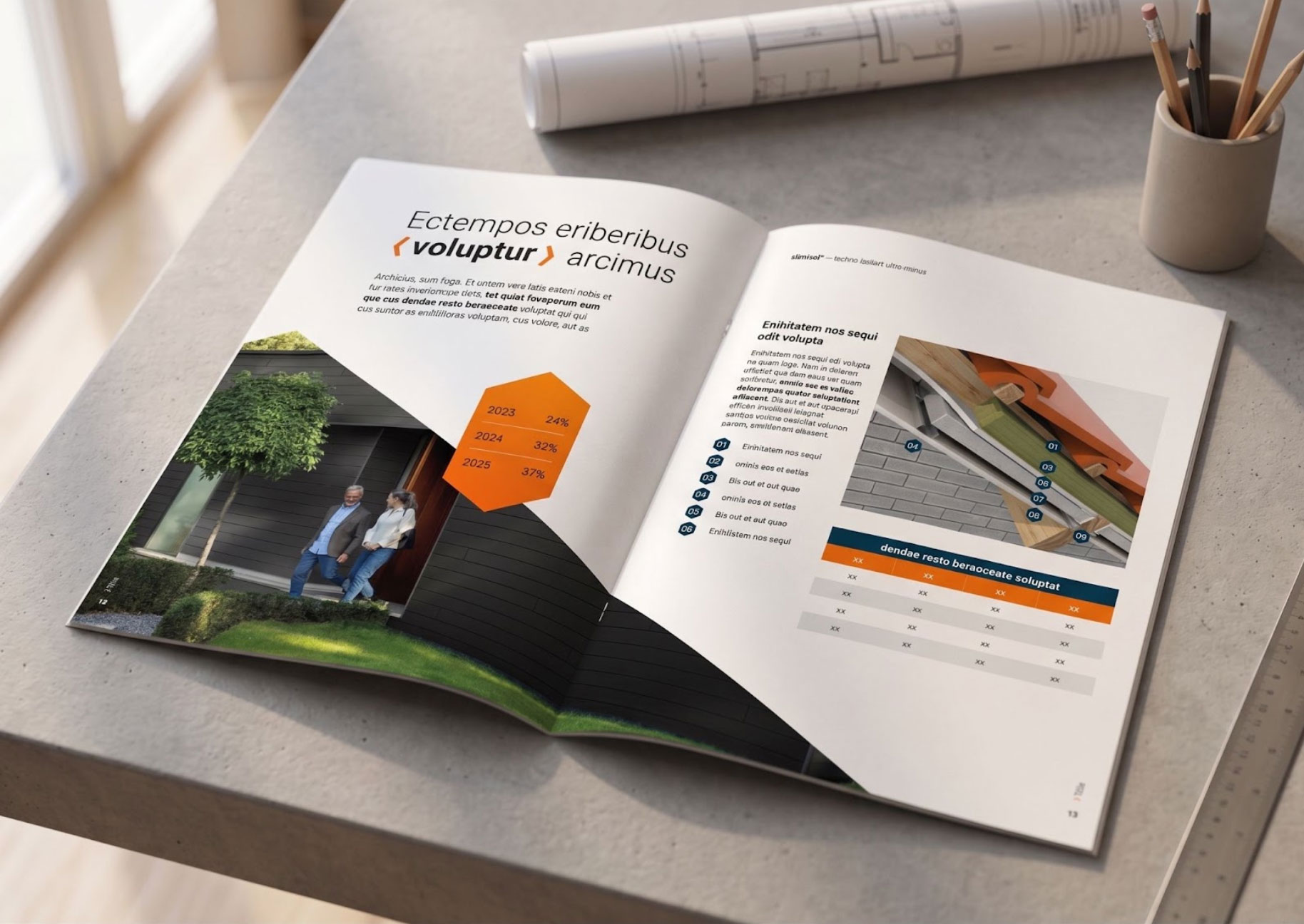
A strong brand needs no explanation. It’s recognised directly by the elements it’s built with, and by the language it speaks to its internal and external stakeholders.