
GREEN PACKAGING DESIGN:
As a communication agency, it’s becoming increasingly challenging to approach green packaging design creatively. Take into account your audience, printer and client, and the relatively limited green materials and methods available. But in the end, the most successful green packaging aligns with consumer expectations while maintaining brand consistency.
In short: green packaging design means that consumers, printers, and brands often want three different things. Your design should be influenced by consumers’ expectations surrounding ‘green packaging’, while packaging should also be involved early to align with branding, materials, and regulations. At the same time, focus on form and design to make your packaging stand out, as package aesthetics directly impact perceived product value and sustainability.
How sustainability fuels packaging innovation
Green packaging design is no longer just a trend, it’s an expectation. Each stakeholder brings essential requirements to the table: consumers demand sustainable and recyclable packaging, printers need to maintain quality while achieving profitable margins, and brands require packaging that enhances their identity. Additionally, products like food or toys must comply with strict material and labelling regulations, while adapting production lines can be costly.
As a packaging design agency, you find yourself in the middle of this complex triangle. This intricate balance often limits certain creative tools, such as varnishes or metallic finishes, which are less sustainable. Rather than viewing these restrictions as obstacles, designers can treat them as opportunities to innovate.
Proven design patterns build trust in green packaging
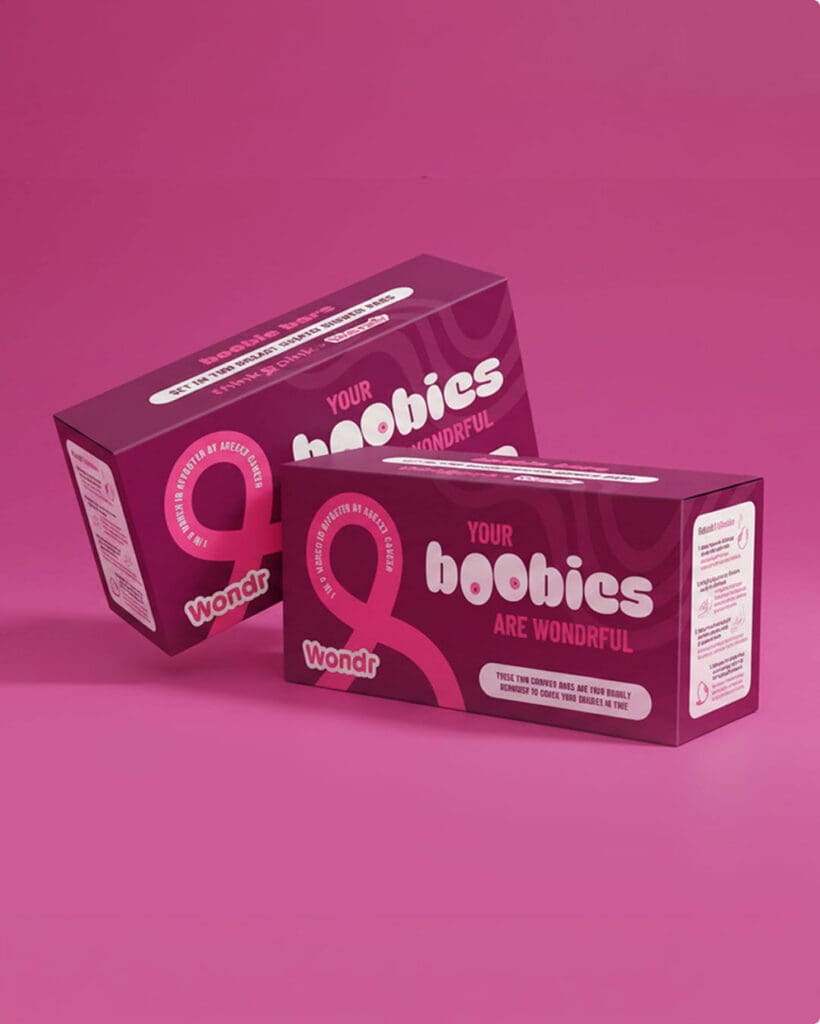
While it’s tempting to push boundaries with radical designs, market research consistently demonstrates that successful green packaging follows established visual patterns. Consumers have developed clear expectations about sustainable packaging aesthetics: natural colours, minimalistic designs, and earthy textures create an immediate emotional connection that signals environmental responsibility.
While innovation is essential, the most effective approach is to evolve within these established parameters. This doesn’t mean limiting creativity, rather, it’s about understanding and leveraging these proven design codes to create packaging that resonates rationally and emotionally with your audience.
When sustainable packaging aligns with these expected visual cues, it improves brand perception and increases purchase intent and consumer trust.
Green packaging works best when it starts early
Effective green packaging requires early integration into the product development cycle. This proactive approach enables:
- Material optimisation: Early involvement allows exploration of sustainable alternatives that might not be apparent later
- Cost efficiency: Identifying optimal packaging solutions before product finalisation prevents expensive redesigns
- Regulatory compliance: Early planning ensures adherence to industry-specific requirements
- Brand alignment: Seamless integration with overall brand strategy and visual identity
Common pitfalls occur when packaging is treated as an afterthought. For example, a brand may assume their product requires a box. However, after consultation, a designer might recommend a more sustainable and cost-effective option, such as a blister pack or tube.
The earlier packaging design is integrated into the product development process, the more effectively the form, materials, and design can align with the brand’s goals. Early involvement also ensures compliance with industry regulations, particularly when materials and labelling standards are tightly controlled.
Why packaging form and design build trust
The way a product is packaged creates an immediate visceral response that shapes consumer perception of both quality and environmental commitment. This first physical interaction becomes the foundation for brand trust and product evaluation. Two key aspects come into play:
- Form: the physical structure of the packaging. Does the shape minimize material waste? Is it practical for shipping? Does it resonate with the product’s branding? A thoughtfully designed form can reduce costs, improve functionality, and enhance brand storytelling.
- Design: the visual and tactile elements. As we mentioned above, green packaging often comes with its own set of design expectations. Consumers associate ‘eco-friendly’ with certain design elements and materials. While these design codes can be challenged, brands must strike a balance between disrupting norms, meeting consumer expectations and keeping up with production.
Making your packaging green? Start with the right question.
Lim Sijmons helps brands navigate between looking sustainable and earning trust on the shelf.
"*" indicates required fields
When packaging design becomes a cultural symbol
Keep in mind that packaging is a powerful tool for shaping perception. Consumers often assign value to a product based on how it’s packaged, not just financially but in terms of values like quality and sustainability. Does the packaging feel ‘green’, ‘premium’ or ‘affordable’? Green packaging should align with a brand’s identity and signal its commitment to sustainability without resorting to greenwashing. A well-designed package adds emotional and ethical value to a product, helping it stand out in a crowded market.

Lim Sijmons
Lim currently serves as Design Director at June20 and has been with the company for over 10 years. Lim has extensive experience having previously worked with agencies like TBWA and notable clients like PWC Belgium, Etex, Beaphar and Smeg. Lim’s expertise spans brand identity, webdesign, and typography, making her a versatile and skilled design director.
More insights?
Get them delivered right in your mailbox.
"*" indicates required fields
More news


FIND US
@Home

Some days you’ll find us at our home offices across the country.
