Branding is essential for any company looking to make an impact on the market. It’s not just about a catchy name and a nice logo; it’s about building a relationship with your target audience. A strong brand identity can help you stand out in a crowded marketplace, communicate your values, and connect emotionally with your customers.
Start with the right strategy
Design is a powerful tool for creating emotional connections between people and brands. However, good design should be driven by strategy rather than personal taste or subjective opinions. At June20, we apply our Engineering Emotions approach to everything we do. We always start from a strategy – the brand story – and use it in our branding methodology. By using design drivers drawn from our strategic, we can create impactful and emotionally resonant designs that engage people.
The rebranding of Vondelmolen is an excellent example of our branding methodology in action. Vondelmolen has a history spanning 126 years, and the challenge was creating a brand identity that would resonate with modern audiences while staying true to its heritage.
We took our design drivers out of the strategic vision to achieve this, which helped us stay focused and make informed design decisions. The main driver for Vondelmolen’s design was power, which made sense given spice cake’s ability to provide sustained energy. We used a colour palette that exuded power and added dynamic elements to create tension.
Focus on consistency
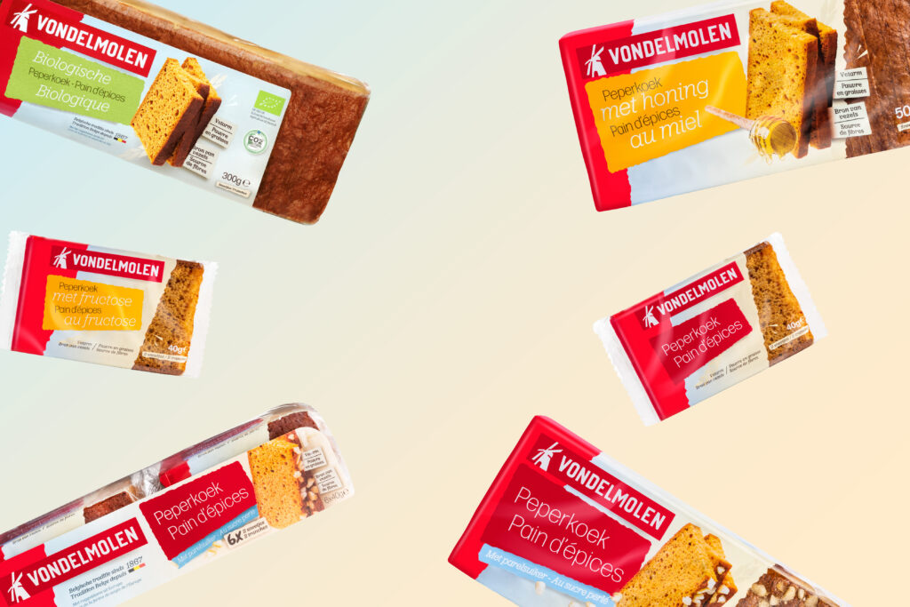
Consistency is key when it comes to branding. Every visual element should enhance the brand experience, from the logo to the packaging design. Packaging design, in particular, plays a crucial role in the success of a product in the store. It is often the only point of contact between the customer and the product, so it needs to stand out and convey the brand’s essence.
In the case of Vondelmolen, we evolved the brand from an all-red brand with brown heritage kraft paper to a modernised brand that used more dynamic elements. We’ve reduced the red in the brand identity to make red stand out even more and added different colours to create tension and convey power. The layout and placement of the elements all derive from the strategic insight of power. Typography was used to create a sense of connection between other elements.
Brand evolution or brand revolution?
Brand evolution or revolution can depend on several factors. A drastic redefinition of the strategy may justify a total revolution. However, taking smaller steps that bring us closer to the strategy sometimes makes more sense.
In the case of Vondelmolen, we opted for a revolution when it came to the packaging – something completely different – but for the logo, we took an evolutionary approach. We made minor adjustments to give the logo more power in line with the strategy, but continuity for the consumer was our top priority.
Design is a continuous process of Engineering Emotions and connecting people with brands. Brands must evolve with changing times and people’s needs to stay relevant.
Want to get even more inspired? Check out our activation campaign for Vondelmolen here.
