MINIMALIST PACKAGING DESIGN:
Minimalist packaging design is everywhere these days. Brands use it to look stylish, sustainable, and accessible. But here’s the problem: when everyone does it, nothing stands out anymore. Instead of grabbing attention, minimalist packaging can blend into the background and become a sea of sameness on the shelf.
Minimalism started as a way to cut through the clutter of loud, busy designs. The clean look, soft colours, and simple layouts were fresh and elegant. But now, it’s so common that it’s lost its impact, leading to monotony rather than distinction. How do you catch someone’s eye when every product around you blends in?
When minimalist design sends the wrong brand message
Your product packaging design needs to be instantly recognisable and based on consumer expectations because people have certain ideas about how packaging should look. For example, if you’re selling tomato soup, the label should show tomatoes. It sounds obvious, but minimalist packaging designs often skip these clear cues, leaving people unsure about what’s inside.
What looks clever and cool in a design meeting doesn’t always work in real life. Shoppers want packaging that’s clear and easy to understand. And here’s another twist: super simple designs can make premium products seem cheap, especially when not every step in the customer journey follows the same principle. Studies show people often associate minimalism with lower-cost or generic brands. So, even if your product is high-end, minimalist packaging might send the wrong message. The irony is unmistakable: brands invest heavily in high-quality materials and refined minimalist aesthetics, only to reduce the product’s perceived worth.
Boardroom vs shelf: why minimalist packaging struggles on crowded retail shelves
The appeal of minimalism often stems from how it appears in controlled environments, like boardrooms, presentations, or design reviews. Clean, uncluttered mock-ups shine under studio lighting or on a designer’s screen. But on retail shelves, these designs face fierce competition from more vibrant, informative, or expressive packaging.
The challenge is even bigger online. On e-commerce sites, for example, the limited resolution and scale of product thumbnails can make minimalist packaging design almost invisible. Also, packaging that performs well in-store doesn’t necessarily grab attention online. The key to balancing in-store and online is taking a broader, more integrated perspective on branding.
First-time buyers vs brand loyalty: the difference between attracting and retaining with packaging
Another layer of complexity in packaging design is the balance between appealing to first-time buyers and holding on to loyal customers. Minimalist packaging often intrigues and draws in new customers through its sleek and modern look. However, this effect diminishes with repeat purchases. Once the initial intrigue wears off, the packaging must offer something more, like recognisability, trust, or clear product benefits.
Want a second pair of eyes on your packaging?
Lim Sijmons reviews packaging every day. She’ll tell you what’s working, what isn’t, and what you can’t afford to strip away.
"*" indicates required fields
Broader view on packaging design: aligning product, packaging, and perception
At June20, we believe packaging should do more than just look good. Sure, we would love to win more design awards. But we’d rather win you some customers. Packaging should tell your brand’s story, stand out in any setting, and make sense to your audience. Great packaging strikes a balance: simple enough to look modern, but detailed enough to be clear and recognisable.
The good news: there are ways to achieve minimalism without falling into its pitfalls. To nail it, your packaging should align seamlessly with your product and brand identity. Take Apple, for example. Their minimalist packaging design works because product and packaging offer one cohesive experience. The sleek, understated design complements the premium feel of their devices, reinforcing the brand’s identity. Now imagine a Blackberry packaged in Apple’s signature style: it wouldn’t feel right. Apple triumphs by using subtle but effective design cues that enhance product perception and recognition.
The key lies in finding the balance: stripping back unnecessary clutter while keeping enough detail to catch the essence of your product and brand. Combining minimalism with strong brand elements, relevant visual cues, and multi-channel adaptability can elevate packaging from simply looking good to working effectively.
How can June2O help you?
At June20, we approach packaging design as part of a brand’s bigger picture. By considering consumer behaviour, market positioning, and channel-specific requirements, we ensure that packaging not only looks appealing but also performs across all touchpoints. Whether it’s adding recognisable product cues, creating adaptable designs for digital platforms, or combining a beauty with functionality, we help you avoid the minimalism trap.

Lim Sijmons
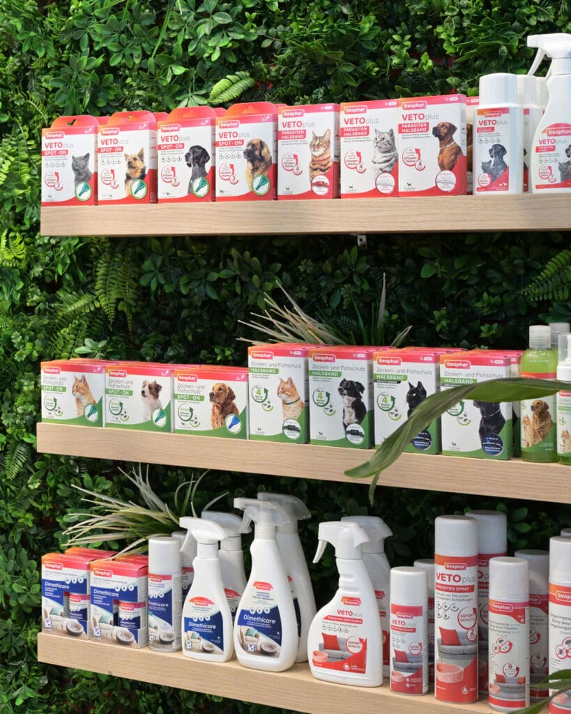
Lim currently serves as Design Director at June20 and has been with the company for over 10 years. Lim has extensive experience having previously worked with agencies like TBWA and notable clients like PWC Belgium, Etex, Beaphar and Smeg. Lim’s expertise spans brand identity, webdesign, and typography, making her a versatile and skilled design director.
More insights?
Get them delivered right in your mailbox.
"*" indicates required fields
More news


FIND US
@Home
Some days you’ll find us at our home offices across the country.
MINIMALIST PACKAGING DESIGN:
Minimalist packaging design is everywhere these days. Brands use it to look stylish, sustainable, and accessible. But here’s the problem: when everyone does it, nothing stands out anymore. Instead of grabbing attention, minimalist packaging can blend into the background and become a sea of sameness on the shelf.
Minimalism started as a way to cut through the clutter of loud, busy designs. The clean look, soft colours, and simple layouts were fresh and elegant. But now, it’s so common that it’s lost its impact, leading to monotony rather than distinction. How do you catch someone’s eye when every product around you blends in?
When minimalist design sends the wrong brand message
Your product packaging design needs to be instantly recognisable and based on consumer expectations because people have certain ideas about how packaging should look. For example, if you’re selling tomato soup, the label should show tomatoes. It sounds obvious, but minimalist packaging designs often skip these clear cues, leaving people unsure about what’s inside.
What looks clever and cool in a design meeting doesn’t always work in real life. Shoppers want packaging that’s clear and easy to understand. And here’s another twist: super simple designs can make premium products seem cheap, especially when not every step in the customer journey follows the same principle. Studies show people often associate minimalism with lower-cost or generic brands. So, even if your product is high-end, minimalist packaging might send the wrong message. The irony is unmistakable: brands invest heavily in high-quality materials and refined minimalist aesthetics, only to reduce the product’s perceived worth.
Boardroom vs shelf: why minimalist packaging struggles on crowded retail shelves
The appeal of minimalism often stems from how it appears in controlled environments, like boardrooms, presentations, or design reviews. Clean, uncluttered mock-ups shine under studio lighting or on a designer’s screen. But on retail shelves, these designs face fierce competition from more vibrant, informative, or expressive packaging.
The challenge is even bigger online. On e-commerce sites, for example, the limited resolution and scale of product thumbnails can make minimalist packaging design almost invisible. Also, packaging that performs well in-store doesn’t necessarily grab attention online. The key to balancing in-store and online is taking a broader, more integrated perspective on branding.
First-time buyers vs brand loyalty: the difference between attracting and retaining with packaging
Another layer of complexity in packaging design is the balance between appealing to first-time buyers and holding on to loyal customers. Minimalist packaging often intrigues and draws in new customers through its sleek and modern look. However, this effect diminishes with repeat purchases. Once the initial intrigue wears off, the packaging must offer something more, like recognisability, trust, or clear product benefits.
Want a second pair of eyes on your packaging?
Lim Sijmons reviews packaging every day. She’ll tell you what’s working, what isn’t, and what you can’t afford to strip away.
"*" indicates required fields
Broader view on packaging design: aligning product, packaging, and perception
At June20, we believe packaging should do more than just look good. Sure, we would love to win more design awards. But we’d rather win you some customers. Packaging should tell your brand’s story, stand out in any setting, and make sense to your audience. Great packaging strikes a balance: simple enough to look modern, but detailed enough to be clear and recognisable.
The good news: there are ways to achieve minimalism without falling into its pitfalls. To nail it, your packaging should align seamlessly with your product and brand identity. Take Apple, for example. Their minimalist packaging design works because product and packaging offer one cohesive experience. The sleek, understated design complements the premium feel of their devices, reinforcing the brand’s identity. Now imagine a Blackberry packaged in Apple’s signature style: it wouldn’t feel right. Apple triumphs by using subtle but effective design cues that enhance product perception and recognition.
The key lies in finding the balance: stripping back unnecessary clutter while keeping enough detail to catch the essence of your product and brand. Combining minimalism with strong brand elements, relevant visual cues, and multi-channel adaptability can elevate packaging from simply looking good to working effectively.
How can June2O help you?
At June20, we approach packaging design as part of a brand’s bigger picture. By considering consumer behaviour, market positioning, and channel-specific requirements, we ensure that packaging not only looks appealing but also performs across all touchpoints. Whether it’s adding recognisable product cues, creating adaptable designs for digital platforms, or combining a beauty with functionality, we help you avoid the minimalism trap.
Lim Sijmons
Lim currently serves as Design Director at June20 and has been with the company for over 10 years. Lim has extensive experience having previously worked with agencies like TBWA and notable clients like PWC Belgium, Etex, Beaphar and Smeg. Lim’s expertise spans brand identity, webdesign, and typography, making her a versatile and skilled design director.
More insights?
Get them delivered right in your mailbox.
"*" indicates required fields


FIND US
@Home
Some days you’ll find us at our home offices across the country.
