The product itself is a crucial touchpoint the consumer has with a brand. How do you design this interface to touch the buyer on an emotional level? That was the challenge we faced when developing an entirely new packaging architecture for Beaphar, the global pet care brand.
Beaphar has a very wide product range. The challenge was to add consistency and brand recognition – based on Beaphar’s new brand positioning. A seemingly contradicting challenge was to add enough differentiation as well, to maintain a clear difference between the different product ranges and categories.
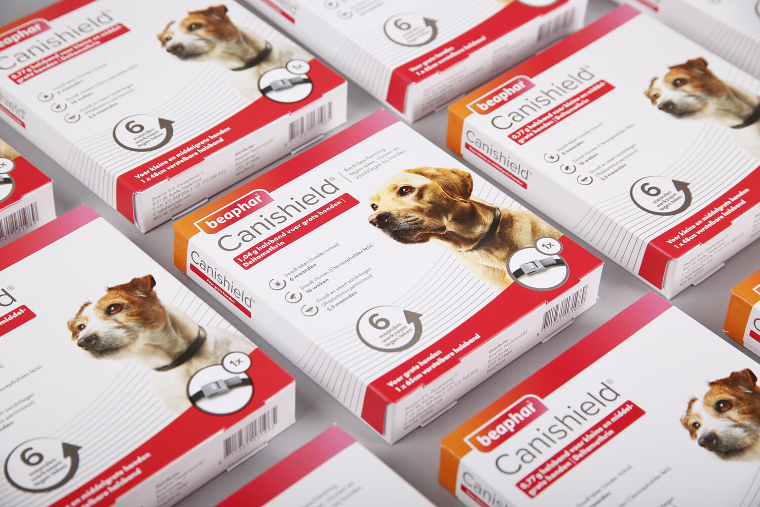
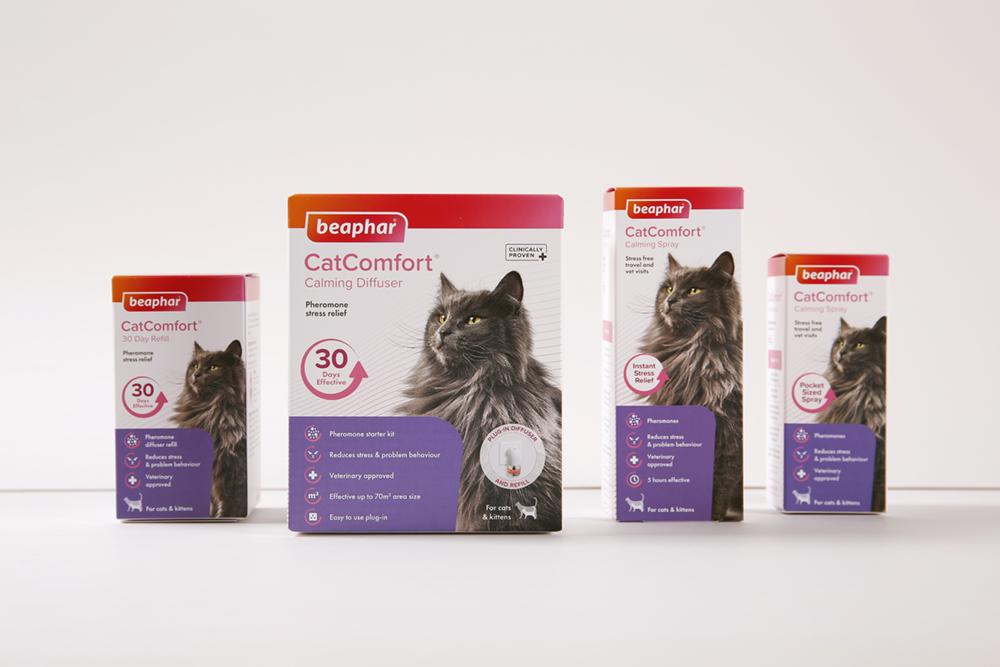
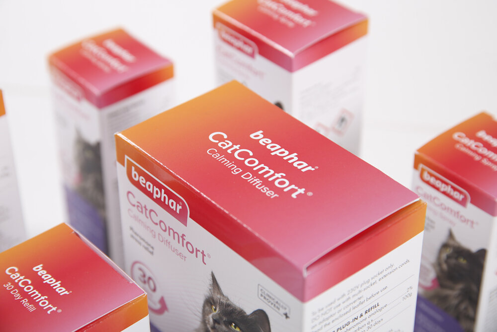
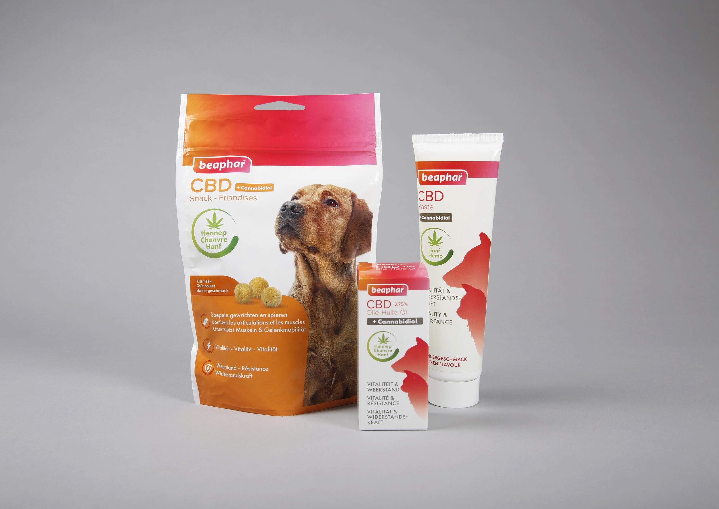
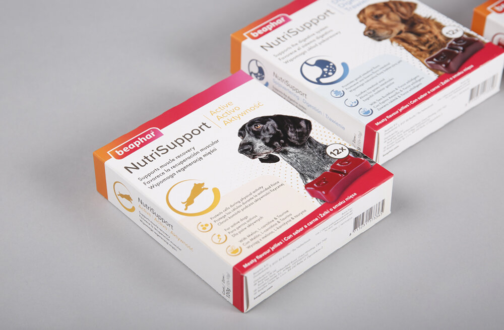
The starting point for the design was the brand essence we defined for Beaphar: “Because pets are family too”. Photography, typography and use of colour were all chosen to support these soft values. As a branded house each product falls under the Beaphar brand, which strengthens the brand equity.
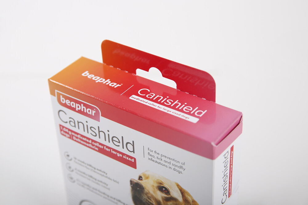
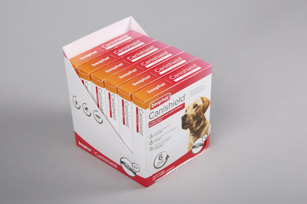
Three product categories were determined: Nutrition, Health, Care. Each of these categories was given its own colour codes that can be found on the top of the box, and that are derived from the colours in the logo gradient. Each category has its own design drivers: i.e. ‘Health’ has a pharmaceutical atmosphere, whilst ‘Care’ and ‘Nutrition’ use more FMCG codes.
A consistent pack architecture aids consistency and recognition. However, different brand shapes, colours, codes and design drivers for each product make sure that there is enough differentiation. This allows the buyers to recognize the products as Beaphar products from a specific range, but also to see enough difference to find the product that they are looking for.
Take a look at the designs for the first 4 hero product ranges right here.
Gutzandglory also developed corporate and packaging guidelines in collaboration with the graphical department of Beaphar headquarters in the Netherlands.